
Arrange Photos Calendar Layout: The 2026 Method
· 9 min read
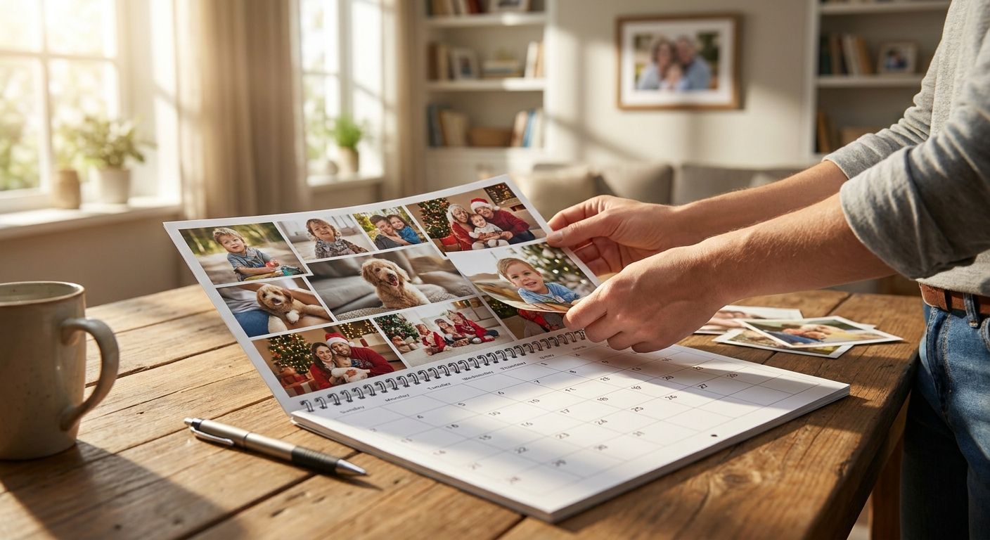
Twelve months, twelve photos, and one blank grid that's easy to get wrong — this guide walks through the exact order to pick, size and place family photos so the finished calendar reads like a story instead of a slideshow.
TL;DR
- Sort photos by month and season first, not by favourite — a beach shot in January looks wrong even if it's a great photo.
- Mix portrait and landscape orientation across the year so no two consecutive months feel identical.
- Keep one anchor family member or pet visible in at least 6 of the 12 months for visual continuity.
- Upload images at a minimum of 300 DPI at your chosen print size or the calendar will look soft on the wall.
- A personalised calendar built this way gets used all year; one built from 12 random favourites gets flipped once and forgotten.
Why This Matters
A calendar isn't a photo album pinned to a wall — it's viewed daily, usually from a few feet away, for 30 days at a stretch before the next page turns. Get the arrange photos calendar layout wrong and the whole thing feels like an afterthought, even with great source photos.
Most people build their calendar in the order photos sit on their camera roll. That's the fastest way to end up with three near-identical group shots in a row and a blurry phone photo stuck in the month everyone actually looks at — December. Planning the layout before you upload anything fixes that in one sitting, and it's the difference between a personalised calendar that stays on the wall through 2026 and one that gets replaced by March.
What You'll Need
- 15-20 candidate photos (more than 12 gives you room to cut weak ones)
- A spreadsheet, notes app, or printed calendar grid to plan month-by-month before uploading
- Photos in the highest resolution available — phone originals, not screenshots or downloaded copies
- A mix of orientations: at least 4-5 landscape and 4-5 portrait shots
- 20-30 minutes of uninterrupted planning time before you touch the design tool
The Steps
1. Sort every candidate photo by season and event
Group your 15-20 shortlisted photos into rough buckets: winter, spring, summer, autumn, and any fixed events (birthdays, holidays, a wedding). This stops you accidentally putting a snow scene in July.
Do this on paper or in a notes app before opening any design tool — it's faster to move a bullet point than to redo a finished layout. Expect 2-4 photos per season once you're done sorting.
Common mistake: sorting by best photo instead of season. A stunning portrait taken in August still looks wrong sitting in the February slot.
2. Assign one photo per month based on what actually happened then
Match real events to real months where you can — the family holiday goes in the month it happened, the school photo goes near the start of term, and the Christmas shot goes in December, not January.
For months with no obvious event, use a seasonal or candid shot instead of forcing a stretch. A relaxed garden photo works for a quiet month; a forced photo for the sake of filling June does not.
Common mistake: leaving the hardest months (quiet ones like February or November) until last and settling for whatever's left over.
3. Alternate orientation month to month
Landscape and portrait photos crop differently on a calendar grid, and running three portrait shots in a row makes the whole thing feel flat. Alternate where you can — landscape, portrait, landscape — so each month feels distinct when you flip the page.
If you're short on one orientation, crop a strong landscape shot into a tighter portrait crop rather than stretching it. A 3:2 landscape crops cleanly to 4:5 portrait without losing the main subject in most cases.
Expected outcome: by month 6, no two consecutive pages should look like duplicates of each other from across the room.
4. Build in one recurring face or pet across the year
Pick one anchor — a child, a pet, a couple — and make sure they appear in at least 6 of the 12 months. This gives the whole calendar a thread that ties January to December, even though the settings and seasons change.
This works especially well with kids' calendars and pet calendars, where the whole point of the personalised calendar for is watching one subject through the year rather than random unconnected shots.
5. Check resolution and cropping before you commit a photo to a slot
A photo that looks sharp on a 6-inch phone screen can look soft printed at A3 or A4 calendar size. Aim for at least 300 DPI at your chosen print size — most modern phone photos clear this easily, but downloaded or messaged photos (which get compressed) often don't.
Zoom in to 100% on your screen before uploading. If it looks blurry at that zoom, it'll look blurry printed too.
Common mistake: using a photo pulled from WhatsApp or Instagram, which compresses images on send and can drop resolution by more than half.
6. Preview the full 12 months side by side before ordering
Most design tools let you flick through pages one at a time, which hides pattern problems. Before finalising, scroll through a thumbnail view of all 12 months at once and check for repeated colours, repeated orientation runs, or two similar-looking group shots sitting close together.
Swap anything that clashes now — it's a five-minute fix before printing and a wasted calendar after.
7. Cross-check against key dates before submitting
Double-check birthdays, anniversaries and school terms are marked correctly on the grid itself, not just that the right photo sits in the right month. A calendar with a stunning June photo and a wrong birthday date underneath it still gets the date wrong every day for 30 days.
Troubleshooting
- Every photo looks the same colour palette. Pull 2-3 candidates from a different season or location to break up the run — a beach photo next to five garden photos resets the eye.
- You've only got portrait photos. Crop the strongest 2-3 into landscape versions rather than forcing all 12 months into the same shape; variety matters more than using the original crop.
- The anchor subject is missing from 4+ months. Swap in any photo, even an imperfect one, where they appear — continuity across the year beats a technically better photo with no connecting thread.
- A photo looks soft when previewed at full size. Go back to the original file rather than a downloaded or shared copy — compression from messaging apps is the most common cause of blur.
- Two group shots look nearly identical. Put at least two months between them, or swap one for a solo or candid shot instead.
- You can't decide between two photos for one month. Pick the one with the better orientation match to the months either side of it, not the better photo in isolation.
Ready to build your 2026 calendar?
Upload your sorted photos and lay them out month by month in minutes.
Tools and Resources
- A notes app or spreadsheet for the season/event sort in Step 1
- Your phone's photo app, filtered by date, to confirm what actually happened each month
- A simple photo editor for cropping landscape shots to portrait (or vice versa)
- If you're working entirely from a phone, you can order photo prints straight from your phone without ever touching a laptop
What to Do Next
Once the 12 months are locked, the same sorting logic works for other formats too — if you've got leftover photos that didn't make the cut, a photo calendar for a specific occasion or a second smaller calendar is often a better home for them than cramming two events into one month.
FAQ
What's the best way to arrange photos on a calendar layout?
Sort photos by season and event first, then assign one per month based on what actually happened, alternating landscape and portrait orientation as you go. This avoids the common mistake of forcing photos into the wrong season.
How many photos do I need for a 12-month calendar?
Start with 15-20 candidate photos for a 12-month calendar so you have room to cut weaker shots. Sorting more than you need is faster than hunting for a replacement mid-layout.
Should every month have the same type of photo?
No. Alternating landscape and portrait orientation month to month keeps the calendar visually distinct as pages turn. Repeating the same orientation or colour palette across several months makes the whole calendar feel flat.
What resolution do I need for calendar photos?
Aim for at least 300 DPI at your chosen print size, which most original phone photos meet easily. Photos downloaded from WhatsApp or Instagram are often compressed below this and can print soft.
Should I match photos to real months or just pick favourites?
Match real events to real months where possible: holidays, birthdays and school photos should sit near when they happened. For quiet months with no fixed event, a seasonal or candid shot works better than a forced fit.
Is it better to feature one person or the whole family across the calendar?
Keeping one recurring face or pet visible in at least 6 of the 12 months gives the calendar a visual thread through the year. This works particularly well for kids' and pet calendars built around one main subject.
Can I use screenshots or downloaded photos in a calendar?
Avoid screenshots and messaging-app downloads where possible, since both compress the original image and can drop resolution enough to look soft when printed. Go back to the camera roll original whenever you can.
When should I finalise the layout before ordering?
Preview all 12 months in a thumbnail or overview view before submitting, not just page by page. This is the only way to catch repeated colours, orientations or near-identical shots sitting too close together.
One Last Thing
The month people check most often on a wall calendar is the current one, so the photo sitting in this month gets seen daily for roughly 30 days straight — worth giving that slot your strongest, sharpest shot rather than saving it for a safe filler photo.