
Office Wall Photography Ideas 2026: What Actually Works
· 9 min read
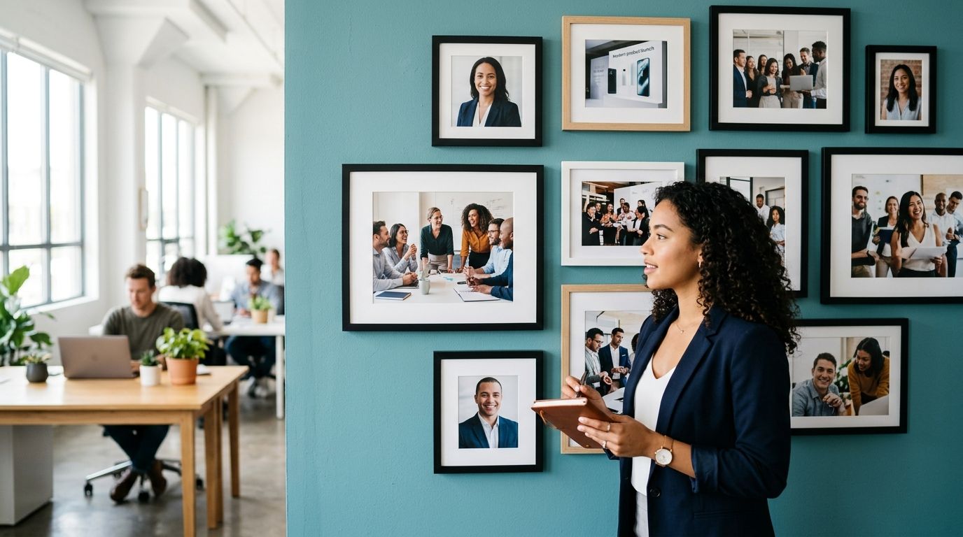
An office wall works when the photos share one visual language: same framing style, same colour treatment, and a clear focal point that pulls a visitor's eye before they've said hello. Skip the mismatched selfies and phone screenshots — the wall should read as one deliberate piece, not a noticeboard.
TL;DR
- Office wall photography ideas work best with a single canvas style repeated across the space, not a mix of frames and finishes.
- Cap group shots at 8-10 faces per panel so individual team members stay recognisable at a glance.
- Split canvas layouts of 2-4 panels suit long office walls better than one oversized print in 2026 open-plan layouts.
- Reshoot outdated team photos before printing — a wall with three departed staff undercuts the brand it is meant to reinforce.
Why this matters
A wall of team and brand photography does two jobs at once: it tells clients who they're dealing with, and it tells staff they're part of something worth photographing. Get the selection wrong and the wall looks dated within a year — half the faces gone, the branding out of step with the current logo, the lighting inconsistent panel to panel.
The fix isn't a bigger budget. It's a tighter brief before anyone picks up a camera: consistent background, consistent crop, and a plan for how the finished prints will actually hang. A personalised calendar for office teams uses the same discipline — pick photos that still make sense in twelve months, not just the ones that look good today.
How to choose brand and team photos for an office wall
Start with the wall itself, not the photo folder. Measure the space, decide how many panels you want, then work backwards to which photos fit that layout.
| Layout | Best photo mix | Best for |
|---|---|---|
| Single large canvas | One hero shot: full team or headline brand image | Reception walls, single focal point |
| Split canvas (2-4 panels) | Sequential or thematic shots — office life, product, team | Long corridors, open-plan offices |
| Multi-photo collage | 6-12 smaller images, mixed candid and posed | Culture walls, breakout rooms |
| Gallery grid | Individual headshots, evenly spaced | Team introduction walls |
A split canvas layout reads better across a long office wall than one oversized print, because each panel carries its own moment — the founders, the workshop floor, the client handshake — without cramming everything into one frame. Split canvas wins for offices wider than 3 metres; a single canvas wins for a reception nook under 2 metres.
Once the layout is set, apply four filters to every candidate photo:
- Lighting consistency — mixed daylight and overhead-fluorescent shots side by side look unfinished, even when the content is strong.
- Face count — cap group shots at 8-10 recognisable faces per panel; beyond that, individuals blur into a crowd.
- Recency — a photo older than 18-24 months risks showing former staff or an old office fit-out.
- Brand colour bleed — a stray red hoodie in an otherwise navy-and-white palette pulls focus from the person wearing it.
Choosing the right canvas size and collage layout
Size decisions come before photo decisions, because an image that looks sharp at 60x40cm can go soft blown up to 100x70cm. Check the right canvas print size for your wall against the actual wall dimensions before shortlisting anything — a portrait phone shot rarely suits a wide landscape panel without a crop that cuts people's arms off.
For mixed-photo collages, layout matters as much as content. A grid of equal squares reads as more professional in a reception area than a scattered, tilted-frame arrangement. Save the playful tilt for a breakout room or kitchen wall where the tone is more relaxed.
Single canvas: best for one strong hero image
A single large canvas — the founding team outside the building, the whole staff at a launch event — works when you have one image strong enough to carry a wall alone. Best for: reception areas and boardrooms where one confident statement beats a gallery of smaller ones. Verdict: Use when that hero shot exists; Skip if the best available photo is a phone snap with awkward cropping.
Split canvas: best for long walls and multiple themes
Two to four panels let you tell a sequence — culture, product, team, client work — without forcing unrelated content into one frame. Each panel is viewable on its own as people walk past. Best for: open-plan offices and corridors longer than 3 metres. Verdict: Use for any wall wider than a single canvas can comfortably fill.
Collage grid: best for team introduction walls
A grid of individual headshots gives every team member equal visual weight, which matters more on a "meet the team" wall than one dramatic group photo does. Six to twelve images is the workable range before it feels cluttered. Best for: HR walls and new-starter areas. Verdict: Use when the brief is introducing people, not selling a brand moment.
Desk-level displays: best for smaller budgets
Not every office needs a full wall. Smaller framed pieces and acrylic photo blocks for desk displays let each team keep its own photos at eye level without committing a whole wall to one layout. Best for: hot-desking floors and shared studios where wall space is limited. Verdict: Use alongside a main wall, not instead of one.
Why office wall photos vary in impact
- Background consistency — a shared backdrop, or the same corner of the office across all headshots, makes a grid read as intentional rather than assembled.
- Colour grading — photos edited by different people on different phones rarely match; one quick edit pass before printing fixes it.
- Photo age — team photos more than two years old start including people who have left, which undercuts trust rather than building it.
- Crop discipline — wide-angle office shots usually have too much dead space; crop tight on the people and the brand elements before sending to print.
- Aspect ratio — a wide team photo shot in panorama mode needs specific handling; see how to print panoramic photos without cropping before committing to one long panel.
- Viewing distance — a photo read from 1 metre in a corridor needs a tighter crop than one viewed from 5 metres across a reception floor.
Related questions
What size canvas works best for a reception wall?
Scale the canvas to the wall width rather than picking a standard size — measure first, shortlist photos second. A canvas that is too small on a large wall looks like an afterthought, and one that is too large crowds a narrow corridor in a 2026 open-plan fit-out.
How many team members should appear in one photo?
Eight to ten faces per panel is the practical limit before individuals stop being recognisable at normal viewing distance. Beyond ten, split the group across two or three panels instead of squeezing everyone into one frame.
Can brand logos and team photos share one canvas wall?
Yes — a split canvas or collage layout can pair a logo panel with team and office photos, as long as the colour palette across all panels stays consistent. Keep the logo panel visually simple so it does not compete with faces for attention.
Plan your office wall this year
Start with the team photos your office calendar already uses.
One last thing
Reshoot before you print. Most office walls age badly not because the canvas fails but because three of the ten people in the photo have left by the following year — a five-minute reshoot in 2026 saves a full reprint in 2027. Pixa Prints canvas prints hold up far longer than the staff list does.
FAQ
What are good office wall photography ideas for a small team?
A single canvas of the whole team, sized to fill the main wall without dead space, works best for teams under 15 people. Add a second smaller panel showing the office space itself if the wall allows it.
Is a split canvas better than one large canvas for an office?
Split canvas wins on walls wider than 3 metres because it shows multiple moments instead of forcing everything into one image. A single large canvas suits a smaller focal wall such as a reception nook.
How often should office team photos be updated?
Every 18-24 months is a practical cycle, or sooner if more than two or three people have left since the last shoot. Outdated faces on a brand wall undercut the trust the wall is meant to build.
What photo format suits a wide office corridor?
A multi-panel split canvas suits a wide corridor better than one oversized print, since each panel can be read individually as people walk past. Panoramic phone shots need careful handling to avoid stretching or losing key details.
Can I mix candid and posed photos on one office wall?
Yes, provided lighting and colour grading stay consistent across the mix. A collage grid handles mixed candid and posed shots better than a single hero canvas does.
How many photos fit on a collage-style office wall?
Six to twelve photos is the typical range before a collage starts to feel cluttered. Equal-sized squares in a grid read as more professional than a scattered tilted-frame arrangement.
Should office wall photos include the company logo?
A logo panel works well alongside team photos in a split canvas or collage layout, as long as the colour palette matches across every panel. Keep the logo panel simple so it does not compete with faces.
How much of the wall should the artwork cover?
Aim for the artwork to fill most of the usable wall width rather than floating in the centre of a large blank space. Measure the wall, then choose the canvas or panel set that matches it.